Improving Contrast on stlouis-mo.gov
The latest style update makes the City website more accessible
This article is 8 years old. It was published on July 14, 2017.
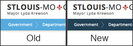
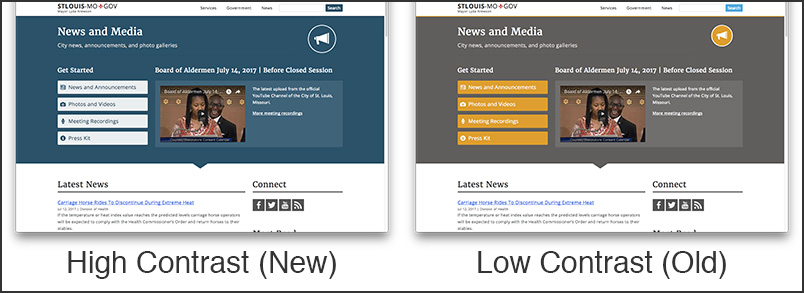
Colors on stlouis-mo.gov are being updated to create more contrast between text and backgrounds as part of a continuous effort to make City services accessible to all.

Periodic accessibility tests and focus groups are done by the City of St. Louis web team to identify areas of stlouis-mo.gov that need improvement. The brighter blues, greens, and oranges of our previous design, when combined with white text, did not conform to the minimum contrast ratio of 4.5:1 set by Web Content Accessibility Guidelines (WCAG) 2.0.
The 4.5:1 ratio is used in this provision to account for the loss in contrast that results from moderately low visual acuity, congenital or acquired color deficiencies, or the loss of contrast sensitivity that typically accompanies aging.
These colors have been darkened and in some cases replaced to create a color scheme that is easier on the eyes, especially for folks who have low vision.

We on the web team hope that these changes are helpful and we encourage people to send us feedback about color contrast issues and anything else related to web accessibility on stlouis-mo.gov.
Related Resources
-
Contact Information:
Benjamin Durnell
Web Development Specialist II -
Department:
Community Information Network
-
Topic:
Local Government Services