 GOV
GOV
City Website Transitions to Responsive Design
It is projected that by 2014 over 50% of website requests will be made from mobile devices.
This article is 14 years old. It was published on June 1, 2012.
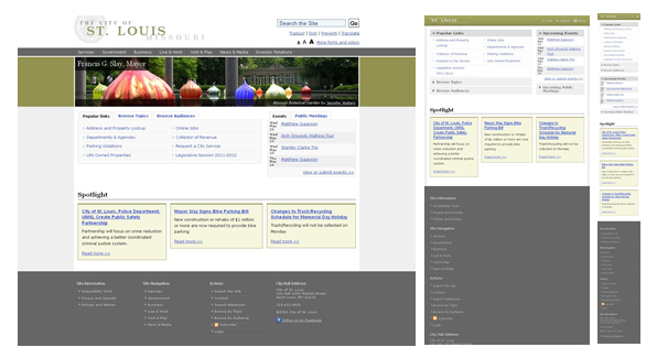
The City website is now using a responsive web design that scales gracefully for mobile devices. The site automatically formats to a wide variety of screen sizes, from smartphones, to desktop and everything in between.
The web team chose responsive design as its strategy to meet the growing use of mobile devices to access its website content. A trend supported by findings from the Pew Research Center, Nielsen, and Gartner that project that by 2014 over 50% of website requests will be made from mobile devices.
The website adoption of responsive design makes all its content accessible to mobile devices, an improvement over a scaled-down mobile website that links to a fraction of the site content.
The implementation of responsive design has the future in mind. The rapid development of mobile devices will make it more likely that users can access the website content with the latest tool available.
Users can see how http://stlouis-mo.gov and other website render on multiple devices using this tool.
-
Contact Information:
Sonja Pelli
Manager of Internet Services and Community Information Network -
Department:
Community Information Network
-
Topic:
Local Government Records
Most Read News
- Greg Hayes Receives APWA Award The Vincent Tallo Service Award recognizes individuals with 30 or more years of service with a single organization, municipality, or firm.
- Precautionary Boil Water Advisory Lifted as of July 1 10am for Parts of North and South City There were two affected areas (one in North city and one in South city) under the precautionary boil water advisory issued June 30, 2026.
- City of St. Louis Approves Permit for Data Center Project, Announces Significant Conditions and Community Benefit Framework This approval comes with a significant number of required conditions to address concerns raised by the community, including noise, walkability, sustainability and the use of power and water.
Help Us Improve This Page
Did you notice an error? Is there information that you expected to find on this page, but didn't? Let us know below, and we'll work on it.
Feedback is anonymous.